In a real build, most icon libraries are a liability, generating lint errors and random viewBoxes. Icons8 is an engineering-grade asset system. Its predictable geometry, clean paths, and cross-platform formats survive production without the usual drama.
- Why Icons8 Fits Modern App Stacks
- From Design Tokens to Code Without Hand‑Holding
- Mobile Pipelines That Don’t Fight You
- Figma to Code With Fewer Surprises
- Semantics, Localization, and the Boring Accessibility Bits
- Performance: Bundle Budgets and Rendering
- The Middle Layer: Messaging, Commerce, System
- Anatomy Checks That Save QA Cycles
- Governance: Treat Icons Like Code
- Dark Mode, High Contrast, and Theming
- What Designers Care About (and How the Files Help)
- What Developers Care About (and Aren’t Annoyed By)
- Classroom and Bootcamp Use
- Cross‑Platform Edge Cases
- Common Failure Modes and How to Avoid Them
- Quick Start for Product Teams
- Final Take for App Creation
Why Icons8 Fits Modern App Stacks
Icon libraries usually fall apart the moment you wire them into a real build. Paths aren’t optimized, viewBoxes are random, stroke weights wobble, and your CI catches a dozen lint errors from malformed SVGs. Icons8 holds up under the boring parts that ship products: predictable geometry, clear naming, and formats that behave in web, iOS, Android, and cross‑platform toolchains. This isn’t a mood board; it’s an asset system that survives production.
From Design Tokens to Code Without Hand‑Holding
Icons are only “consistent” if the rules are machine‑checkable. Start with tokens and wire icons to them.
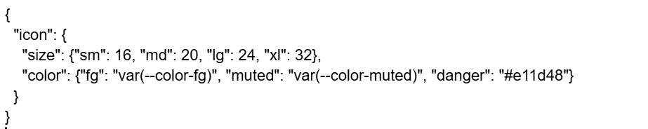
Tie SVG width/height to size tokens. Use currentColor so theme swaps don’t require new assets. Icons8’s vectors rarely ship with hard‑coded fills, so you don’t have to run path surgery before importing.
React (web) in One Minute
import Check from “./icons/check.svg”;
export function Icon({as: As = Check, size = “md”}) {
const px = {sm: 16, md: 20, lg: 24, xl: 32}[size];
return <As width={px} height={px} role=”img” aria-hidden />;
}
Run svgo with conservative plugins. With Icons8 you can keep precision sane (2–3 decimals) without breaking shapes.
Sprite vs. Inline
- Sprite <use> keeps network requests low and plays well with caching.
- Inline SVG is best when you need per‑instance aria labels or animation. Icons8’s paths are clean enough for motion without extra cleanup.
Also Read: How AI App Builders Are Making Coding Obsolete
Mobile Pipelines That Don’t Fight You
iOS
SF Symbols are great, until your metaphor doesn’t exist or your brand demands a different silhouette. Icons8 exports slide into Xcode as single‑color PDFs or as multicolor assets for marketing surfaces. Keep UI icons single‑color and lean on tintColor.
Android
Prefer Vector Drawable when possible; it scales, themes, and shrinks APK size. Icons8’s SVGs import to Vector Drawable with minimal edits because path data is simple and masks are rare. If you must rasterize, export WebP at 1x/2x/3x and let aapt crunch.
Flutter / React Native
Use flutter_svg or react-native-svg. Icons8’s consistent viewBoxes (often 0 0 24 24 or 0 0 32 32) simplify sizing. Keep one component per glyph and pass color via currentColor/color prop.
Figma to Code With Fewer Surprises
The Figma plugin route works, but discipline matters. Lock style families (e.g., Outline 24 or Filled 24). Don’t mix radii or stroke weights on a whim. Icons8’s families give parallel states—outline/filled/duotone—so you can encode emphasis without inventing a new visual language every sprint. Teach juniors the 16‑px squint test; if it fails, change the metaphor, not the zoom level.
Semantics, Localization, and the Boring Accessibility Bits
An envelope might mean “mail” in most regions; a mailbox flag is US‑specific. Icons8 usually ships alternates (envelope, paper plane, chat bubble, phone) so you can localize metaphors without redrawing. Pair icons with visible labels in critical flows. When labels collapse, add aria-label or aria-labelledby. Thin strokes at 14–16 px are risky; prefer filled or medium‑weight outlines for core actions.
Performance: Bundle Budgets and Rendering
- SVG sprites + HTTP/2: one request, many glyphs, good cache behavior.
- Tree‑shaking: If you import SVGs as components, purge unused ones at build time.
- CPU: Over‑nested groups and filters kill perf; Icons8’s files are largely flat.
- Compression: Run svgo but avoid over‑aggressive float trimming. You want small, not mangled.
The Middle Layer: Messaging, Commerce, System
Products ship with three icon clusters over and over: communication, money, and system plumbing. Icons8 covers all three with variations per tone. Chat‑centric apps use dots/bubbles; enterprise email flows lean on envelope/arrow metaphors; fintech screens need card, bank, and transfer icons that still read at 16 px. If you’re standardizing a messaging surface, the whatsapp icon drops into dark hero sections and status toasts without losing contrast.
Anatomy Checks That Save QA Cycles
- Silhouette reads at 16 px.
- Counters stay open in small sizes.
- Stroke math is consistent across the family.
- ViewBox aligns to grid; no phantom off‑by‑one.
- No hard fills unless it’s a brand glyph.
Icons8’s catalog clears these basics more often than most libraries, which is why handoff bugs trend down.
Governance: Treat Icons Like Code
Put icons in the repo, not on someone’s desktop. Review via PR like any dependency. Require:
- Signed‑off viewBox and size tokens.
- Lint: svgo + a custom check that forbids inline colors.
- A changelog when silhouettes change.
Icons8’s clear naming keeps diffs readable—message-circle to message-circle-filled is a semantic change, not a surprise.
Dark Mode, High Contrast, and Theming
Run two parallel families: filled for primary, outline for secondary. Keep a minimum 3:1 icon‑to‑background ratio for essential affordances. Because Icons8 SVGs typically inherit color, you can toggle themes with a single token swap instead of exporting night‑mode versions.
What Designers Care About (and How the Files Help)
- Corner radii: Step changes are deliberate; rounded sets don’t fight sharp sets.
- Optical fixes: Diagonals and circles get nudged so they don’t shimmer on low‑DPI displays.
- Metaphor consistency: Notifications, actions, objects—each track has a consistent grammar.
What Developers Care About (and Aren’t Annoyed By)
- Deterministic layout: Icons align on both pixel and optical centers.
- Sprite friendliness: No duplicate IDs, no stray defs.
- Build stability: Minimal filters and masks—less chance of a headless Chrome render bug during tests.
Classroom and Bootcamp Use
Real teaching moments aren’t “what is an icon,” they’re experiments:
- Squint Lab: Place outline icons over noisy backgrounds, then switch to filled and quantify the recognition delta.
- Metaphor Audit: Compare save = cloud vs. tray vs. arrow‑to‑disk and discuss context.
- Grid Discipline: Redraw three glyphs at 12, 16, and 24 px. Preserve silhouette and counters.
Icons8 gives enough variants to run these exercises without Franken‑sets.
Cross‑Platform Edge Cases
- Electron/PWA: Keep one SVG source and rasterize favicons at build. Icons8’s shapes hold at 16×16 without turning into mush.
- Email: Many clients still dislike SVG. Export PNG/WebP from the same master and keep naming parallel.
- Canvas/WebGL: Convert paths to polygons once and reuse buffers; clean paths from Icons8 reduce tesselation overhead.
Common Failure Modes and How to Avoid Them
- Icon fonts: Avoid. Accessibility and anti‑aliasing are worse than SVGs. If you inherit one, plan a swap.
- Mixing vendors: One off‑brand glyph ruins cohesion. Use the alternate inside Icons8’s family instead.
- Color spaghetti: Keep UI glyphs neutral; reserve accents for state.
- Padding roulette: Define container boxes. Icons8 centers well, but your layout needs rules.
Quick Start for Product Teams
- Pick a base family (Outline 24 or Filled 24) and commit.
- Define –icon-size tokens (16/20/24/32) and wire to components.
- Build an SVG sprite for the top 80 glyphs.
- Add lint to block inline colors and random viewBoxes.
- Maintain a small “alternates” folder for A/B tests.
Final Take for App Creation
Icons8 behaves like an engineering‑grade asset system. Clean vectors, stable geometry, and format coverage keep the design–dev handshake civil. You get enough style range to match product tone without breaking the grid. For teams building web, mobile, or cross‑platform apps, the library reduces redraws, trims bundle drama, and keeps QA focused on product logic—not on why the settings gear looks off by half a pixel.